


Géraldine puts her passion for the web, marketing and communication, writing and storytelling at the service of companies and entrepreneurs.
The Internet has disrupted virtually everything we do in our daily lives, including when we go out to eat:
- more than one person in every two searches for information online before going to a restaurant,
- 21% have already booked a table online,
- once at the restaurant, almost half of consumers surf the web on their smartphones to post opinions, share their experience, send pictures of their dishes (food porn), or simply to pass the time…
Faced with this reality, it is in restaurants’ interest to be present – and active – online. Don’t yet have a website and are thinking about taking the plunge? Want to give your current site an overhaul to make it more modern and effective in terms of converting visitors to customers? If the answer to either of these questions is “Yes”, here are 4 key considerations for your restaurant’s website!
Responsive design
You’ve no doubt heard about responsive design, i.e. the art of designing a website optimized for easy browsing on all types of device, no matter what their screen size. Today, Internet users don’t think twice about “moving on” if their experience if anything less than good. 40% acknowledge that, if a site gives them a disappointing mobile browsing experience, they will turn towards a competitor site. Consequently, having a mobile-friendly website is not just about keeping up with trends or even offering a pleasant user experience; it is a strategic and commercial prerequisite. All the more so since April 2015, when Google updated its search algorithm so that sites with a responsive design feature more prominently in its SERPs.
What does all that mean in concrete terms?
That if your website is not mobile-friendly, it will continue to be accessible by mobile Internet users, however Google’s ubiquitous search engine will downgrade it to the benefit of responsive sites. According to certain estimates, non-responsive sites could be losing up to 10% of their traffic! If you are in any doubt as to how your site displays on a mobile device, you can use the mobile-friendly test, a free, highly effective tool that will quickly establish a diagnosis and show you what your users see when they reach your site via a mobile device.
Your website’s choice of colours
Colours play an important role in the design of your website. They convey emotions, arouse reactions and influence user behaviour. For example, two colours are recognized as having a directly opposite effects on people’s appetites: orange, which stimulates it, and blue, which can temper or even spoil it. Acknowledged as a stimulating, energizing colour, red is widely used in the fast food industry. Brown rhymes with stability, yellow with joy, white with purity, black with luxury and elegance… Below are 10 colours that will set the style in 2017, both in the world of fashion and web design. See which ones inspire you! 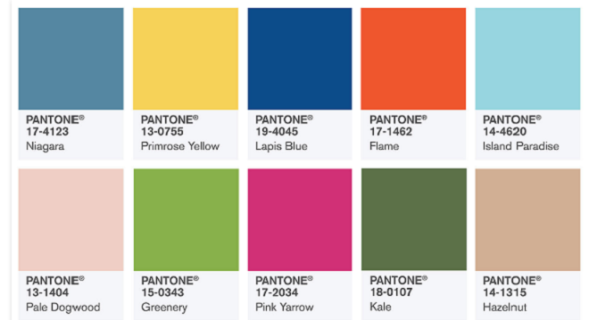 Caution: if you are planning to promote your establishment internationally, it might be a good idea to check what meaning certain colours carry in the target country; these meanings may differ from one country to another. Thus, for example, in Asian countries, white is associated with death. Beyond their meanings, colours can also help to prioritize your content in order to make it clearer, more easily readable and more hard-hitting. They also serve to “set the tone”, and help visitors get an idea of what they can expect.
The 60-30-10 rule
To make sure that your website is pleasant on the eye, keep in mind the 60-30-10 rule, which has proven its worth with countless webdesigners:
- choose a primary colour that takes up 60% of the space;
- choose a secondary colour (the tonic) that will ideally contrast with the primary colour: it should take up 30% of the space;
- lastly choose a third and possibly a fourth colour that take(s) up 10% of the space. These proportions will help to attract visitors’ eyes to the site’s strategic elements (call-to-action buttons, business hours, menu, promotions, etc.).
To help you with this approach, you can use the triangle technique. On the colour wheel below, draw an equilateral triangle to obtain 3 colours which, when combined, will create a pleasant harmony. 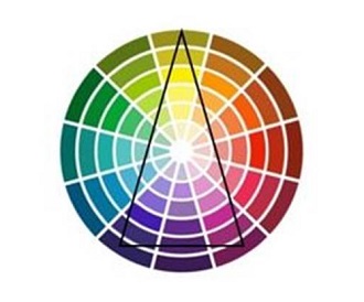 By following these rules, you will help to ensure that your website does not look like a (badly decorated) Christmas tree!! To go even further in this respect, here are two practical tools that may well come in handy when choosing your Internet site’s shades and colours:
- Eye dropper: is there a colour on the web that catches your eye? Eye Dropper is an extension available to Google Chrome users that allows you to pick a colour from any webpage and define the code.
- Paletton.com: a comprehensive tool that helps you define which shades and colours to combine with your primary colour. You can combine between 1 and 4 colours.
Call-to-action buttons
As its name suggests, a call-to-action button is a button that literally calls a user to take a predefined action. The goal is to transform your visitors into leads, your leads into customers, and lastly your customers into key influencers. The idea is to place call-to-action buttons at key locations on your website, and so prompt visitors to perform certain actions, such as:
- Sign up for your newsletter
- Download a coupon to benefit from a promotion
- Join you on the social networks
- Make an online booking
- Place an online order
- Receive your blog’s RSS feed
- Register for an event that you have organized
- Request a quote for a catering service
- and so on…
Basically, a call-to-action button is a graphic element that invites the visitor to take action. It can be a hypertext link, an image, a button, etc.
Designing call-to-action buttons
By designing your call-to-action buttons attentively, you will increase your chances of “converting”. Here are a few tips and rules to follow to optimize your call-to-action buttons and capture your visitors’ attention and involvement:
- Use colours that contrast with those of your site.
- Choose a short, incisive text. Avoid passive vocabulary; give preference to action verbs: “Order” or “I want to place an order”, “Book” or “I want to book”, “Sign up” or “Sign me up”, etc.
- Depending on your universe, you can also indulge in a touch of creative madness and originality. For example, the Bagelstein brand name did just that: rather than simply saying “Sign up for our newsletter”, they went for something much more original, which roughly translates as: “Want some spam? Sign up”.
- Avoid overly original designs that are too stylized or mannered. Buttons must look like buttons if you want your visitors to click on them! The most commonly used formats are circles and rectangles.
- Lastly, remember to renew/update your buttons. Otherwise, customers risk not only growing tired of them but, eventually, no longer even seeing them!
Note that you can test out different designs, formats and button positions via A/B testing.
An “About” page
Lots of websites overlook their About page, when they don’t forget it completely. And yet, a carefully crafted About page can set you apart from the competition, improve your referencing via unique content with plenty of keywords, humanize your image and improve your likeability. It’s not always easy talking about yourself. If you suffer from the “blank page syndrome”, you can always call on a professional writer, or reply as simply as possible to the following questions:
- Who are you?
- What values do you defend?
- How and why did you create your restaurant?
- What opportunities have you seized to get to where you are today?
- Which team of staff keeps the restaurant running?
- What would you like your customers to say about your restaurant when they leave after a meal?
Lastly, an About page should tell a story – your story! It should show the restaurant’s human face and offer a peek “backstage”. An About page that does all that is one that reassures and instils confidence, and therein lies the ultimate goal. Note that an “About” page does not necessarily need to be called “About…”. Pizza Hut Malta for example, opted for a page to tell their adventure: “Our story”.

Zing Zing opted to integrate these elements directly in its homepage :

Responsive design, Choice of colours, Call-to-action buttons and About page: here we have shown you 4 key elements to consider when creating or overhauling your restaurant’s website… Obviously this list is by no means exhaustive. Other possible considerations: can your visitors get to the key information in less than 3 clicks? Does your site contain sufficient content for efficient search engine optimization? Are your pictures high-resolution? etc. Lastly, to analyze your audience, understand how visitors behave once they reach your site, gauge the efficiency of your call-to-action buttons, conduct a/b tests, etc., remember to set up a Google Analytics account for your Internet site.


Comments