


Leslie Park Lynn is a 15 year restaurant industry veteran.
As a restaurant trying to promote your brand and bring in new customers you have, no doubt, invested time and money into creating an online presence. Chances are you’ve launched a website and connected it up to important marketing initiatives such as your social media accounts and placed your web address on a variety of other marketing collaterals. But, in a world that is going increasingly mobile, is your website keeping up? Does it really matter?
Going mobile with your website may be the most important thing you will ever do for your online presence. That may be a bold statement but let’s explore the reasons why having a mobile website is critical in growing your customer base, revenues and, ultimately, your bottom line.
Non mobile-friendly restaurant websites frustrate visitors
I’m sure you have visited a non-mobile friendly website on your mobile device at some point. It’s not just difficult to find what you need it is downright aggravating. So much so, in fact, it is estimated that over 50 percent of searchers landing on a non-mobile site will bounce out almost immediately. Losing half the traffic to your site, especially mobile traffic, is unacceptable and damaging to your ability drive incremental growth for your restaurant.
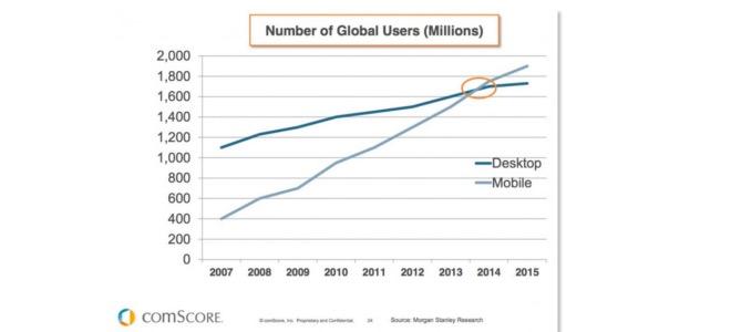
Mobile searches surpassed desktop searches over a year ago in early 2015. One of the most searched categories on mobile devices is restaurants. In fact, according to this article from Google, 94 percent of people who own a smartphone will search for local information on their device and 74 percent of those searches occur in the presence of a desktop computer such as at home or at work. This is because, as a mobile enabled society, we are increasingly making consumer buying decisions on the go and meals out are at the top of the buying category. That being said, it’s not just good enough for you to be found when potential customers search. You must also provide those visiting you online with a good experience and make the information they are seeking easy to find.
Diners visiting restaurant websites are looking for a precise set of information
Those visiting restaurant websites, whether on a mobile or desktop device, are looking for very specific information when considering making a buying decision. At the top of the list is menu, location, online ordering, contact info and hours of operation. Secondarily is reservations, promotions being offered, events and entertainment. If you are exclusively a delivery and/or takeaway establishment allowing visitors to access your online ordering system straight away should take precedence over EVERYTHING.
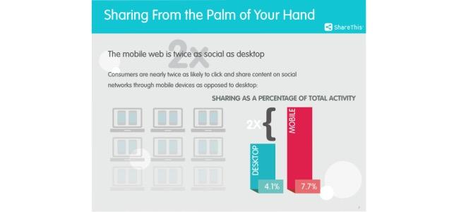
And if you are wondering how mobile can positively impact your social media marketing and the word-of-mouth growth of your restaurant consider this: According to a recent study by ShareThis, internet surfers will share content from their mobile devices at a rate nearly twice as often as that shared from their desktops.
Those who have spent considerable time and resources on food photography, writing content such as “Our Story”, or origin of recipes will, no doubt, be disappointed to find that this is low priority information for visitors. While still important content for search engine optimization and potential public relations it is not what most potential diners are looking for when they visit a restaurant site, especially mobile visitors. You must prioritize the information they want and give it to them in an easy to navigate, streamlined format. Make it difficult for your visitors and they will exit your site and go somewhere else.
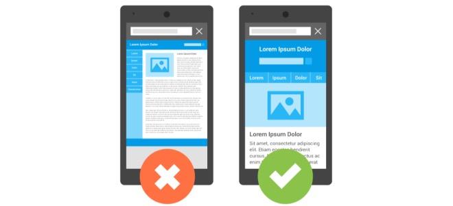
Restaurant websites that adapt to different devices provide a more gratifying experienced or its users
Responsive websites do the best job of providing a smooth and satisfying experience for its visitors. A responsive site is one that adapts to the device being used to access it. This means the site will be displayed in a format that is compatible to the device in a way that makes it easy to navigate and find key information. One of the attributes of mobile sites is that they are “thumb friendly” meaning they can be easily navigated and scrolled with the thumb. Visitors can click on the key areas of information, place a call to you or access a map to your location while holding the device in one hand. Again, it’s all about putting the desired information at your visitors fingertips and providing a seamless, satisfying experience.

Going mobile with your website is no longer an option, especially for smaller restaurant operators trying to compete in a complex, technology driven environment. Additionally, Google now downgrades non-mobile friendly sites in its search engine results and rankings. Don’t get left behind by ignoring the needs of those seeking important information about you at the critical moment of the buying decision. Make sure the experience you are providing your online visitors is as enriching and rewarding as the experience you strive to deliver to your guest everyday in your restaurant.


Comments